Maia Tarling-Hunter – our Lead Service Designer and I wrote this blog post together. She has also shared it on www.maiatarlinghunter.co.uk
Over the past couple of weeks, we’ve been focused on shaping and communicating the Personalised Prevention Services (PPS) strategy, both within our teams and beyond. In this post, we share some of that work in detail. We hope it’s useful as an approach for others, and we’re genuinely open to feedback if we’re missing something.
Service mapping
A significant chunk of our time has gone into working with teams to understand how each team’s work contributes to the strategy now, next and later, and where we might need to course correct. This has gone in both directions. We’ve refined what we have, and teams have found ways to align better with the broader picture.
We were motivated by a practical problem. Team members told us it was hard to see how their day-to-day work connected to the bigger strategic picture. Everyone in PPS needs to be able to see themselves and their work within the strategy for it to provide a meaningful shared direction.
Led by Maia, we ran 60 to 90 minute sessions with each team, using our main service map as an anchor. We asked teams to map what they are building that contributes to the broader PPS vision and could be reusable, and what they need or use from other areas.
The sessions surfaced three things in particular:
- Overlaps, dependencies and opportunities for collaboration that weren’t visible before
- Questions and gaps in the strategy itself, including things that need more work
- How differently people understand our shared goal. Some areas we’re aligned on. Others we’re not yet, and that’s useful to know.
We also asked teams to talk through constraints that would make it hard to scale beyond one MVP or a small area, such as navigating complex data sharing agreements for each new use case. We talked about what it would take for existing products like NHS Health Checks online to become genuinely reusable, and how we test and learn both within individual use cases and at scale.
Our next step is to bring this mapping together into a single shared view of the PPS journey, showing how the different parts connect across first, second and later iterations. We’ll then bring team members back together as a group to build on that shared picture.
Wardley mapping
This work builds on Wardley mapping we did in February with PPS senior leadership. Wardley mapping helps you visualise your value chain against your most fundamental user need. It’s a useful tool for spotting what you’re building, what you’re assuming, and where there’s disagreement. We know defining the right user need is its own significant question, but that’s for another post.
Before the session, we shared an intro video and the framing our Deputy Director Julia Harrison had defined, as not everyone had used Wardley mapping before. We structured the session around two types of components: things we need to meet the user need, such as collecting information from a user, and organisational capabilities we need to deliver, such as getting clinical sign-off or legal agreements in place.
One thing we were clear about from the start: the aim was not perfect clarity. It was surfacing misalignment and having the conversations. To make that work, we used “disagree and commit” as a working principle, and we nominated someone (not the facilitator) to spot rabbit holes and pull us out when we went down one. That turned out to be genuinely useful.
Once we had a rough draft, a few of us refined it asynchronously, ordering the value stream from most visible features to least visible. In a follow-up session, we dot-voted on the areas we disagreed on most, or where we felt the risk was highest and needed more analysis. Below is our latest version which we want to tidy up further.
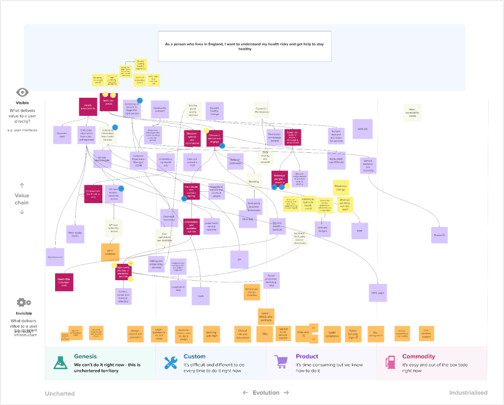
We’ll share the Wardley map more widely as part of communicating our strategy, and use it to find where others have faced similar challenges and what they’ve learned.
Getting feedback
Alongside the internal mapping work, we’ve been talking to people outside the team who either have a stake in our strategy or are working on something similar.
Conversations with Duncan Brown, Chief Technology Officer for DPSP, and Ralph Hawkins, Lead Service Designer for Manage my Health, pushed us to think harder about how we tell the story of the problems we’re trying to solve, and how we align better with the wider DPSP portfolio. Dan Booker-Macedo, our Head of Technology, is currently writing our technology strategy, and making sure our work connects to that is something we’re actively working on.
A recurring question across these conversations was who can and should maintain a quality directory of local prevention services. We don’t have a clear answer yet, but it’s the right question to be sitting with.`
We also spoke with Emma James and Caroline Finucane from Digital Vaccination Services, who are taking a similar approach to mapping the end-to-end vaccination journey. Their “service stage framework” maps, at each stage of the journey, the products and capabilities that each team is developing and the shared outcomes they are delivering towards. We found it useful to see how another team in DPSP is tackling the same alignment challenge, and it’s prompted us to think about whether there are ways to connect our approaches.
What we’ve learned about mapping together
The most useful thing about all of this work has not been the maps themselves. It’s been the conversations they force.
Mapping as a group, whether that’s a service map or a Wardley map, creates a structured reason to surface disagreement, spot assumptions and ask questions that don’t naturally come up in day-to-day delivery. The output matters less than the process of building it together.
If you’re thinking about doing something similar, a few things have helped us. Send preparation materials in advance, especially if people haven’t used the method before. Be explicit that the goal is conversation, not a perfect artefact. Nominate someone to manage scope, because these sessions can sprawl. And plan a follow-up. The first session rarely resolves anything. The real work happens after, when a smaller group refines the rough draft and brings it back.
We’re not done. There’s still alignment work to do, and some of the strategic questions we’ve surfaced don’t have answers yet. But we have a much clearer shared picture than we did a few weeks ago, and that’s what this kind of work is for.

Leave a comment